Typechoice: FUTURA
'Geometric san-serifs are in vogue this year in web and logo design (trendy & modern). Futura is a versatile, high-quality font that is almost as popular as Helvetica. If your goal is to create a design with modern, clean elegance — you can choose Futura with confidence as your typeface of choice.
Futura’s design is based entirely on simple geometric forms — triangles, squares and near-circles . The stroke weight is almost even throughout, and is distinctive for its long ascenders and almost classical Roman capitals — these elements give it its stylish elegance and differentiate it from other geometric san-serifs.
Futura can be used as a display and paragraph font and is seen in many notable and historic projects. This makes it perfect for use in the logotype as it can be adapted on a variety of platforms (headers and body text without jarring).

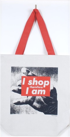
Barbara Kruger's 'I shop therefore I am' (1990) is a perfect reference point to progress the branding of Endure.
Context:
Between the late 1970s and the early 1980s, Barbara Kruger, working as a graphic designer for popular magazines, gained recognition in the art world for photo-based images overlaid with blocks of text in a signature color scheme of black, white, and red. Her practice of culling and editing found photographs and of pairing them with phrases in provocative ways was informed by her interest in feminism and critical theory. These investigate the ways in which ideological messages infiltrate daily life by means of the mass media today.
Barbra Kruger's photograph gives representation to consumption in terms of the literal meaning of the word. By displaying the words, "I Shop Therefore I Am," Kruger is making a statement in regards to material consumption. The open-ended statement allows the viewer to re-think materialism.
Application:
The ways in which this graphic has been reproduced and distribution on an array of products presents its malleability with infiltrating pop culture and fast fashion with a political drive. This is a great representation of how the brand can be developed.

Imagery experimentation
Taking images of clothing examples to present the brand as keeping up with the styles of the fashion world despite its point of difference. The focus was to be on the clothes rather than the models face, as well as normalising realistic depictions of women. The photos were not edited to keep inline with the brands ideology and intentions. The variety of styles seeks to cover the populist target audience.


No comments:
Post a Comment