Conclusions:
consider - supergraphics, posters, books/ magazines, advertising, leaflets, signage, websites
1) 'Collect' by Spin - UK

Collect is an international art fair that took place at London’s Saatchi Gallery. Presented by the Crafts Council, Collect gave visitors the chance to see and buy museum-quality and contemporary ceramics, glass, jewellery, wood, metal and textiles created by established and emerging artists and makers represented by over thirty of the world’s best galleries.
Collect’s brand identity, designed by Spin, draws character, play and visual interest from an economical use of a single and fairly austere font, and a black and white colour palette, and went on to include a variety of print communications including leaflets and catalogue, art direction, animation, advertising, signage and environmental graphics.
Collect successfully combines type and image to enable an identity that can be used in multiple forums. The idea of the slanting l, which is able to stand alone in the first poster, enables consistency throughout the branding that can be utilised within many forums.
2) 'In Search Of The Present' by Werklig at EMMA, Finland

In Search Of The Present is a new series of exhibitions on a 3–4 year cycle held at Helsinki’s Espoo Museum of Modern Art (EMMA). These intend to tackle many of the existential questions that we face in an ever changing world. The first exhibition, inspired by Olavi Paavolainen’s essay collection from 1929, was a study in the representations and expressions of human identity in the digitalised world.
Drawing on the themes of change and the passage of time, Finnish graphic design studio Werklig developed a brand identity connected by a sense of movement, implied in the cropping of text across posters, books, and supergraphics, physically in the motion of outdoor campaign posters, and digitally in the scrolling of social media content.
Using supergraphics could be a strong way to transpire a bold and clear message and identity for the gallery. Especially as Gagosian has multiple locations, a recurring bold signage or wayfinding system that is consistent throughout each location, could become a populist identity that is know therefore, around the world.
3) 'Gallery & Co.' by Foreign Policy, Singapore

& Co. links museum shop, a food and drink retailer and cafe housed within the National Gallery Singapore. These share a brand identity designed by Singapore-based graphic design studio Foreign Policy, built around the basic foundations of modern art and design; primary colour, geometric form and repetition, and Grilli Type’s GT Pressura. This runs across and unites a variety of printed materials that includes, but is not limited to, vouchers, packaging, uniforms and posters.
The use of bold, san-serif clean type, is combination with geometric shapes definitely appeals to a wider audience. The idea of a pattern or print that can be widely recognised alone, and in combination with text could be useful for appealing to those academic and those more visual
4) 'Art Museum' by Underline Studio, Canada
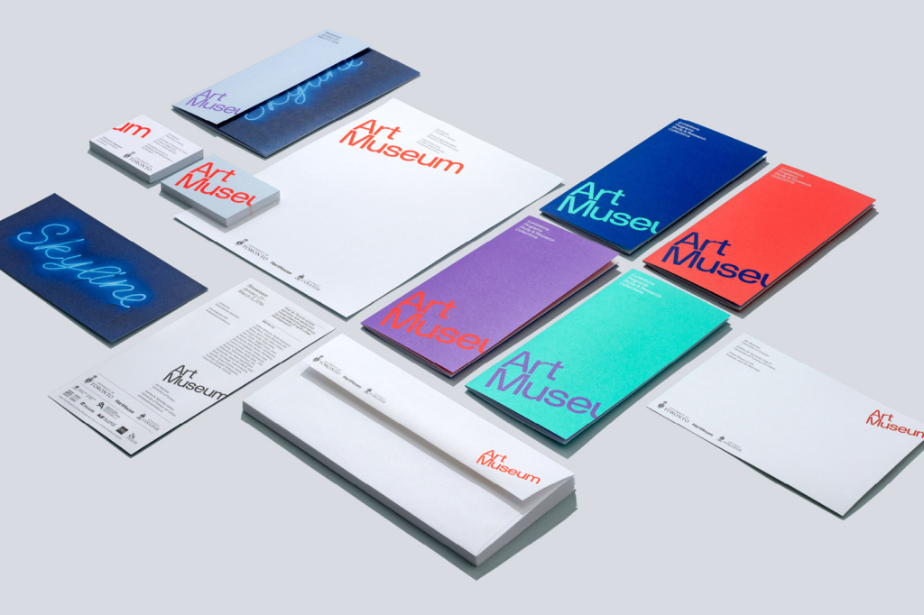
Art Museum unites the Justina M. Barnicke Gallery and the University of Toronto Art Centre as one new institution dedicated to exhibition and education. It is one of the largest gallery spaces for the visual arts in Toronto and is housed within an iconic gothic-style building.
The museum worked with Canadian graphic design studio Underline to develop a new brand identity system that would emphasise its placement within the city, and engage both the university community and the Toronto public. This extends across a variety of print communications including brochures, programs, posters, signage and website.
Here we see an attempt to attract a variety of ages - the university and the general public - as such this is an important reference to look at techniques and styles they used to atract a broader target audience. The bright colours and clarity definitely combine to aid the success of this branding.
No comments:
Post a Comment